Introduction
This Jupyter Notebook introduces Kernel Density Estimation (KDE) alongside with KDEpy. Kernel density estimation is an approach to solve the following problem.
Problem. Given a set of \(N\) data points \(\{x_1, x_2, \dots, x_N\}\), estimate the probability density function from which the data is drawn.
There are roughly two approaches to solving this problem:
Assume a parametric form, e.g. a normal distribution, and estimate the parameters \(\mu\) and \(\sigma\). These parameters uniquely determine the distribution, and are typically found using the maximum likelihood principle. The advantage of this approach is that we only need to estimate a few parameters, while the disadvantage is that the chosen parametric form might not fit the data very well.
Use kernel density estimation, which is a non-parametric method – we let the data speak for itself. The idea is to place a kernel function \(K\) on each data point \(x_i\), and let the probability density function be given by the sum of the \(N\) kernel functions.
Assuming a parametric form is a perfectly valid approach, especially if there is evidence suggesting the presence of a theoretical distribution. However, for exploratory data analysis we might want to assume as little as possible when plotting a distribution, and this is where kernel density estimation and KDEpy comes to the rescue.
[1]:
import numpy as np
from scipy.stats import norm
import matplotlib.pyplot as plt
from KDEpy import FFTKDE  # Fastest 1D algorithm

np.random.seed(123)  # Seed generator for reproducible results

distribution = norm()  # Create normal distribution
data = distribution.rvs(32)  # Draw 32 random samples
The histogram
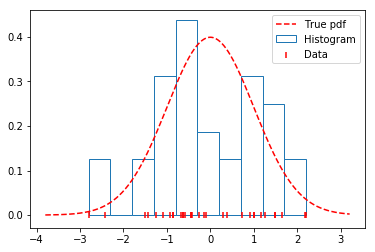
A KDE may be thought of as an extension to the familiar histogram. The purpose of the KDE is to estimate an unknown probability density function \(f(x)\) given data sampled from it. A natural first thought is to use a histogram – it’s well known, simple to understand and works reasonably well.
To see how the histogram performs on the data generated above, we’ll plot the true distribution alongside a histogram. As seen below, the histogram does a fairly poor job, since: - The location of the bins and the number of bins are both arbitrary. - The estimated distribution is discontinuous (not smooth), while the true distribution is continuous (smooth).
[2]:
x = np.linspace(np.min(data) - 1, np.max(data) + 1, num=2**10)

plt.hist(data, density=True, label='Histogram', edgecolor='#1f77b4', color='w')
plt.scatter(data, np.zeros_like(data), marker='|',
            c='r', label='Data', zorder=9)
plt.plot(x, distribution.pdf(x), label='True pdf', c='r', ls='--')
plt.legend(loc='best');
Centering the histogram
In an effort to reduce the arbitrary placement of the histogram bins, we center a box function \(K\) on each data point \(x_i\) and average those functions to obtain a probability density function. This is a (very simple) kernel density estimator.
Since each function \(K\) has \(\int K \, dx = 1\), we divide by \(N\) to ensure that \(\int \hat{f}(x) \, dx = 1\). A kernel density estimator with \(\int \hat{f}(x) \, dx = 1\) and \(\hat{f}(x) \geq 0\) for every \(x\) is called a bona fide estimator.
Enough theory – let’s see what this looks like graphically on a simple data set.
[3]:
from KDEpy import TreeKDE
np.random.seed(123)
data = [1, 2, 4, 8, 16]

# Plot the points
plt.figure(figsize=(14, 3)); plt.subplot(1, 3, 1)
plt.title('Data points')
plt.scatter(data, np.zeros_like(data), marker='|', c='r', label='Data')

# Plot a kernel on each data point
plt.subplot(1, 3, 2); plt.title('Data points with kernel functions')
plt.scatter(data, np.zeros_like(data), marker='|', c='r', label='Data')
for d in data:
    x, y = TreeKDE(kernel='box').fit([d])()
    plt.plot(x, y, color='#1f77b4')

# Plot a normalized kernel on each data point, and the sum
plt.subplot(1, 3, 3); plt.title('Data points with kernel functions summed')
plt.scatter(data, np.zeros_like(data), marker='|', c='r', label='Data')
for d in data:
    x, y = TreeKDE(kernel='box').fit([d])()
    plt.plot(x, y / len(data), color='#1f77b4')
x, y = TreeKDE(kernel='box').fit(data)()
plt.plot(x, y, color='#ff7f0e');
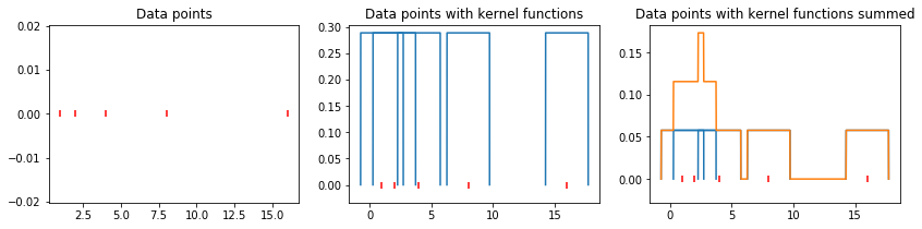
Now let us grapically review our progress so far:
We have a collection of data points \(\{x_1, x_2, \dots, x_N\}\).
These data points are drawn from a true probability density function \(f(x)\), unknown to us.
A very simple way to construct an estimate \(\hat{f}(x)\) is to use a histogram.
A KDE \(\hat{f}(x)\) with a box kernel is similar to a histogram, but the data chooses the location of the boxes.
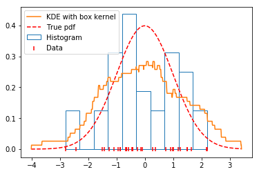
Looking at the graph below, we see that the KDE with a box kernel is the most promising estimate so far.
[4]:
np.random.seed(123)
data = distribution.rvs(32)

# Use a box function with the FFTKDE to obtain a density estimate
x, y = FFTKDE(kernel='box', bw=0.7).fit(data).evaluate()

plt.plot(x, y, zorder=10, color='#ff7f0e', label='KDE with box kernel')
plt.scatter(data, np.zeros_like(data), marker='|', c='r',
            label='Data', zorder=9)
plt.hist(data, density=True, label='Histogram', edgecolor='#1f77b4', color='w')
plt.plot(x, distribution.pdf(x), label='True pdf', c='r', ls='--')
plt.legend(loc='best');
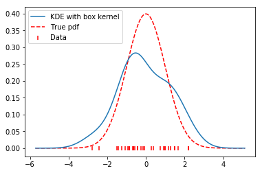
Choosing a smooth kernel
The true function \(f(x)\) is continuous, while our estimate \(\hat{f}(x)\) is not. To alleviate the problem of discontinuity, we substitute the box function used above for a gaussian function (a normal distribution).
The gaussian is smooth, and so the result of our estimate will also be smooth. This looks even better than our previous jagged estimate.
Note (Kernel functions). Many kernel functions are available, see
FFTKDE._available_kernels.keys()for a complete list.
[5]:
# Use the FFTKDE with a smooth Gaussian
x, y = FFTKDE(kernel='gaussian', bw=0.7).fit(data).evaluate()

plt.plot(x, y, zorder=10, label='KDE with box kernel')
plt.scatter(data, np.zeros_like(data), marker='|', c='r', label='Data')
plt.plot(x, distribution.pdf(x), label='True pdf', c='r', ls='--')
plt.legend(loc='best');
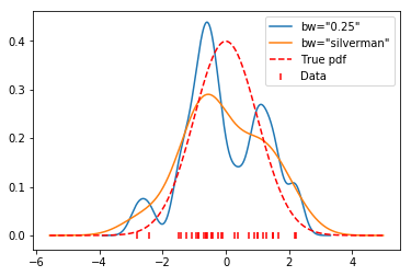
Selecting a suitable bandwidth
To control the bandwidth \(h\) of the kernel, we’ll add a factor \(h >0\) to the equation above.
When \(h \to 0\), the estimate becomes jagged (high variance, overfitting).
When \(h \to \infty\), the estimate becomes oversmoothed (high bias, underfitting).
Note (Bandwidth). The
bwparameter is implemented so that it corresponds to the standard deviation \(\sigma\) of the kernel function \(K\). This is a design choice for consistent bandwidths across kernels with and without finite support.Note (Automatic Bandwidth Selection). Automatic bandwidth selection based on the data is available, i.e.
bw='silverman'. For a complete listing of available routines for automatic bandwidth selection, seeFFTKDE._bw_methods.keys().
In general, optimal bandwidth selection is a difficult theoretical problem.
[6]:
for bw in [0.25, 'silverman']:
    x, y = FFTKDE(kernel='gaussian', bw=bw).fit(data).evaluate()
    plt.plot(x, y, label='bw="{}"'.format(bw))

plt.scatter(data, np.zeros_like(data), marker='|', c='r', label='Data')
plt.plot(x, distribution.pdf(x), label='True pdf', c='r', ls='--')
plt.legend(loc='best');
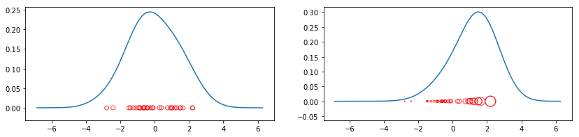
Weighted data
As a final modification to the problem, let’s weight each indiviual data point \(x_i\) with a weight \(w_i \geq 0\). The contribution to the sum from the data point \(x_i\) is controlled by \(w_i\). We divide by \(\sum_{i=1}^N w_i\) to ensure that \(\int \hat{f}(x) \, dx = 1\). Here is how the equation is transformed when we add weights.
The factor \(N^{-1}\) performed uniform weighting, and is removed in favor of the \(w_i\)’s.
Note (Scaling of weights). If the weights do not sum to unity, they will be scaled automatically by KDEpy.
Let’s see how weighting can change the result.
[ ]:
plt.figure(figsize=(14, 3)); plt.subplot(1, 2, 1)
plt.scatter(data, np.zeros_like(data), marker='o', c='None',
            edgecolor='r', alpha=0.75)

# Unweighted KDE
x, y = FFTKDE().fit(data)()
plt.plot(x, y)

plt.subplot(1, 2, 2); np.random.seed(123)
weights = np.exp(data) * 25
plt.scatter(data, np.zeros_like(data), marker='o', c='None',
            edgecolor='r', alpha=0.75, s=weights)

# Weighted KDE
x, y = FFTKDE().fit(data, weights=weights)()
plt.plot(x, y);
Speed
There is much more to say about kernel density estimation, but let us conclude with a speed test.
Note (Speed of FFTKDE). Millions of data points pose no trouble for the FFTKDE implementation. Computational time scales linearily with the number of points in practical settings. The theoretical runtime is \(\mathcal{O}(2^d N + n \log n)\), where \(d\) is the dimension, \(N\) is the number of data points and \(n\) the number of grid points. With \(d=1\) and \(n = 2^{10}\) (the default values), \(N\) dominates.
[8]:
import time
import statistics
import itertools
import operator

def time_function(function, n=10, t=25):
    times = []
    for _ in range(t):
        data = np.random.randn(n) * 10
        weights = np.random.randn(n) ** 2
        start_time = time.perf_counter()
        function(data, weights)
        times.append(time.perf_counter() - start_time)

    return statistics.mean(times)

def time_FFT(data, weights):
    x, y = FFTKDE().fit(data, weights)()

# Generate sizes [5, 10, 50, 100, ..., 10_000_000]
data_sizes = list(itertools.accumulate([5, 2] * 7, operator.mul))

times_fft = [time_function(time_FFT, k) for k in data_sizes]
plt.loglog(data_sizes, times_fft, label='FFTKDE')

plt.xlabel('Number of data points $N$')
plt.ylabel('Average time $t$')
plt.grid(True);
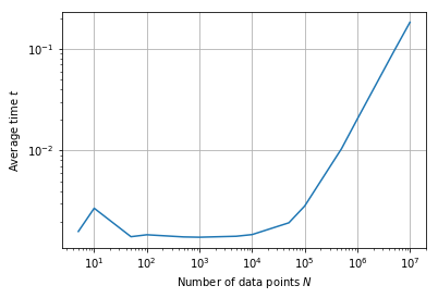
[9]:
for size, time in zip(data_sizes, times_fft):
    print('{:,}'.format(size).ljust(8), round(time, 3), sep='\t')
5               0.002
10              0.003
50              0.001
100             0.001
500             0.001
1,000           0.001
5,000           0.001
10,000          0.001
50,000          0.002
100,000         0.003
500,000         0.01
1,000,000       0.02
5,000,000       0.095
10,000,000      0.183
References
This page introduced quite a bit of theory. If you would like to read more, please see the Literature review section. In particular see the posts by VanderPlas and the books by Silverman and Wand.
